Monday, March 9, 2015

WHERE TO GET RESEARCH TITLE

You may refer to the following links to get more research titles

WORLD ECONOMIC FORUM WEBSITES

WORLD ECONOMIC FORUM FACEBOOK even more exciting titles

Palgrave Macmillan Journals made free for the whole month of march

How to run a check on your chosen title. simply log on to Google scholar and type your research title, if you get MANY relevant citation or refereed journal, that is good title, and the other way around for bad title.

All the best

SS

Friday, March 6, 2015

Poster Templates from around the world

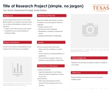
Before thinking about the specifics of your project and the content you’d like to include in your poster, take a look at some templates for student research posters. Many free templates can be found online

In general, most poster templates aim to communicate information clearly and quickly, with visual elements serving to separate different sections of the poster and direct attention to key findings. A clean, easy-to-read poster makes use of helpful visual cues.
  • Lots of white space
  • Elements that are aligned, not too close together and are evenly spaced
  • Limited use of color
  • Judicious use of features to differentiate sections, such as
    • Different font
    • Bolding
    • Size
    • A bar, line or use of color at the section header
  • Attractive, easy-to-read fonts
    • Good ones include Helvetica, Times New Roman, Trebuchet, Century Gothic
    • Sans serif fonts (e.g. Helvetica) usually work a little better than serif fonts (e.g. Cambria)
  • Minimal use of outlines, boxes, color backgrounds, gradients
  • Lots of photos and figures
As you begin the poster-making process, keep in mind the templates below. Note what they have in common (Uni or college watermark, limited and consistent use of color, prominent use of visual aids) and what they don’t include (clichéd fonts, inconsistent style between sections, overly busy colors and backgrounds).


Poster Template 3 
Poster Template 2
Poster Template 3
Poster Template 4


Poster Samples

Poster Samples

Looking at samples of real student posters can help you generate ideas and define your goals. As you get started, it may be helpful to look at examples of finished posters.
Below are a number of sample posters created by Uni Texas undergraduates. There is a brief discussion of each poster highlighting its greatest strengths and areas where there is room for improvement.

STEM sample poster
Strengths

Room for improvement
  • Background may be distracting, or detract from content
  • Sections and images are not aligned
  • Too many visual components clutter poster

STEM sample poster
Strengths

Room for improvement
  • Lacks Citations and Acknowledgements
  • Labeling of images/graphics
  • Inconsistent text alignment
  • Color-saturated background

STEM sample poster
                                                      CLICK HERE FOR LARGER IMAGE
Strengths

Room for improvement
  • Technical language/undefined acronyms (accessible to limited audience)
  • Narrow margins within text boxes
  • Too many thick borders around boxes
  • Uses UT seal instead of college or university wordmark

Research Poster Example
                                                           CLICK HERE FOR LARGER IMAGE
Strengths

Room for improvement
  • Lacks references section
  • May not be accessible to all audiences (some technical language)
  • No need for borders around sections (the blue headers are sufficient)

Business Research Sample Poster
                                                           CLICK HERE FOR LARGER IMAGE 
Strengths

Room for improvement
  • Inconsistent fonts in body text
  • Editing
  • Abstract section mislabeled
  • Bullet points are great, but only if they’re used judiciously

Sociology Sample Poster
                                                           CLICK HERE FOR LARGER IMAGE
Strengths

Room for improvement
  • Discussion of Results
  • Minor formatting misalignments
  • Long title
  • Unauthorized use of UT seal (use wordmark instead)

Sociology Poster Sample
                                                      CLICK HERE FOR LARGER IMAGE
Strengths

Room for improvement
  • Light text on dark background
  • Color backgrounds should be avoided, especially dark ones
  • Unlabeled, non-credited photos

Sociology Poster Sample
                                                            CLICK HERE FOR LARGER IMAGE
Strengths

Room for improvement
  • Many sections without a clear flow between them
  • Lacks acknowledgements

Humanities Research Poster Sample
                                                          CLICK HERE FOR LARGER IMAGE
Strengths

Room for improvement
  • Length/density of text blocks
  • Tiny photo citations
  • Connections between images and descriptive text
  • Vertical boxes unnecessary

Humanities Research Poster Sample
                                                               CLICK HERE FOR LARGER IMAGE
Strengths

Room for improvement
  • Lacks clear Background section
  • Relationship of Findings and Conclusion to Research questions
  • Bullet points are great, but only if they’re used judiciously

Humanities Research Poster Sample
                                                              CLICK HERE FOR LARGER IMAGE
Strengths

Room for improvement
  • Uneven column width
  • Center-justfied body text
  • Lacks “Methods” section

Humanities Research Poster Sample
                                                          CLICK HERE FOR LARGER IMAGE
Strengths

Room for improvement
  • Too many different font styles (serif and sans serif, bold and normal)
  • Concise interpretation of graphics


Research Poster Sample
                                                         CLICK HERE FOR LARGER IMAGE
Strengths
  • Balance among visuals, text and white space
  • Data presented in visual format (SmartArt)
  • Simple color scheme
  • Font sizes
  • Accesible to many audiences (simple enough for general audience, but enough methodological detail for experts)

Room for improvement
  • Some more editing needed
  • When targeting an expert audience (as in the methodology section), should also report statistics (r, p, t, F, etc.)
  • References

Research Poster Guidelines

General specifications
Size: An A1 sheet (equivalent to four A3 sheets).
Orientation: Portrait preferred. 
Lamination: It’s a good idea to get your poster laminated.
Font size: Large enough to be easily read from 1 to 1.5 metres away e.g., 24 point for main text.

Suggested content 
Research / Project Title: Approximately 25 mm tall (point 96). 

Additional identifying information: Approximately 19 to 25 mm (e.g., point 80). May also be on an additional label / strip above the main poster. 
- Name of Organization(s) / Programme / Affiliation 
- Researcher(s) Name 

Problem Outline & Aims: Bulleted information describing the research issues and objectives. 

Summary of Methods: Bulleted information describing how the research was conducted and any challenges encountered.

Illustrations: Photographs, graphs, graphics, or other "art" that illustrate the research project. Graphic information is easier to process quickly than text information. Look for imaginative ways to graphically explain your project and its impact. 

Results & Conclusions: Bulleted information describing your findings and discussing the conclusions of the research programme or project. 

Acknowledgements & References: At the end of the poster. 

Additional information: Any additional information that you think would enhance the presentation.

General Advice 
A research poster is very different from a paper or a talk, and to produce one requires different techniques. Simplicity is essential in a poster – it should tell a story. As in any research presentation, the outline includes a statement of the problem, a description of the method, a summary of the work, and then a presentation of results. But within that structure, there is much scope for creativity. A question-and-answer (Q&A) format, for example, may be appropriate for part of your poster. Brief conclusions should leave the reader with a clear message to take away

A typical reader may spend only 5 minutes looking at your poster, so there should be less clutter and more brief informative statements, with attractive, enlightening graphics. It should not contain a lot of details—you can always explain the fine points to interested participants. Keep in mind that your poster will be one among others in the exhibition area: it needs to capture and hold the reader’s attention. 

Further advice on designing effective posters is available in various books and website articles – for instance, Pennsylvania State University’s guide is a good place to start, and has links to other resources. 

Transporting a poster may be awkward, but rolling the paper into a cylinder is one way around this. As suggested above, you may wish to have A4 sized photocopies of the poster as a handout. Alternatively, if the work presented in the poster has been described in more detail in a paper, consider making the paper (or any associated presentation slides) available as a handout at the poster session. 

References: 
Sven Hammarling & Nicholas J. Higham (2010) ‘How to Prepare a Scientific Poster’, SIAM         guidelines for poster presentations,www.siam.org/meetings/guidelines/poster.php [accessed 6-3-2015] 
Pennsylvania State University (2005) ‘Designing Communications for a Poster Fair’, available at: www.personal.psu.edu/drs18/postershow/ [accessed 6-3-2015] 


Thursday, March 5, 2015

E BOOKS , SAMPLE JOURNALS & NOTES

Dear Business Research Methodology Students,

Please find the E-books used by the ARU for this course and Journals/Reviews for BRM purpose.

Ebooks

1. ENGLISH FOR ACADEMIC RESEARCH WRITING DOWNLOAD HERE

2. EXTENDED WRITING AND RESEARCH SKILLS DOWNLOAD HERE

Journals/Review

1. Corporate behavior vs brand behavior-towards integrated view DOWNLOAD HERE

2. Complaint behavior of Malaysian consumers DOWNLOAD HERE

3. Future of Corporate Social Responsibility DOWNLOAD HERE

4. The importance of corporate brand personality traits to a successful 21st century business DOWNLOAD HERE

5. Why bother about culture in sme & micro firms- innovation culture & entrepreneurial DOWNLOAD HERE

6.The importance of employees in the process of building customer experience  DOWNLOAD HERE

Notes

1. Critical Reading DOWNLOAD HERE

2. How can I choose a good topic for my research paper DOWNLOAD HERE