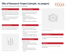
Before thinking about the specifics of your project and the content you’d like to include in your poster, take a look at some templates for student research posters. Many free templates can be found online
In general, most poster templates aim to communicate information clearly and quickly, with visual elements serving to separate different sections of the poster and direct attention to key findings. A clean, easy-to-read poster makes use of helpful visual cues.
- Lots of white space
- Elements that are aligned, not too close together and are evenly spaced
- Limited use of color
- Judicious use of features to differentiate sections, such as
- Different font
- Bolding
- Size
- A bar, line or use of color at the section header
- Attractive, easy-to-read fonts
- Good ones include Helvetica, Times New Roman, Trebuchet, Century Gothic
- Sans serif fonts (e.g. Helvetica) usually work a little better than serif fonts (e.g. Cambria)
- Minimal use of outlines, boxes, color backgrounds, gradients
- Lots of photos and figures
As you begin the poster-making process, keep in mind the templates below. Note what they have in common (Uni or college watermark, limited and consistent use of color, prominent use of visual aids) and what they don’t include (clichéd fonts, inconsistent style between sections, overly busy colors and backgrounds).


No comments:
Post a Comment